Every year I have the pleasure of creating a series of posters and spots for the Public Library system. One of the reasons this particular job is so much fun is that I get to work in a different style every time! This year's flavor was concocted from a combination of tattoo art influence and a bit of 60s rock album cover art. The nice thing is that this is basically how I doodle all the time anyway! Please take a moment to pop over to my site and check out all the styles I currently work in. I'm still cooking with a lot of pots, which is how I like it! I'd love to cook up something for you!
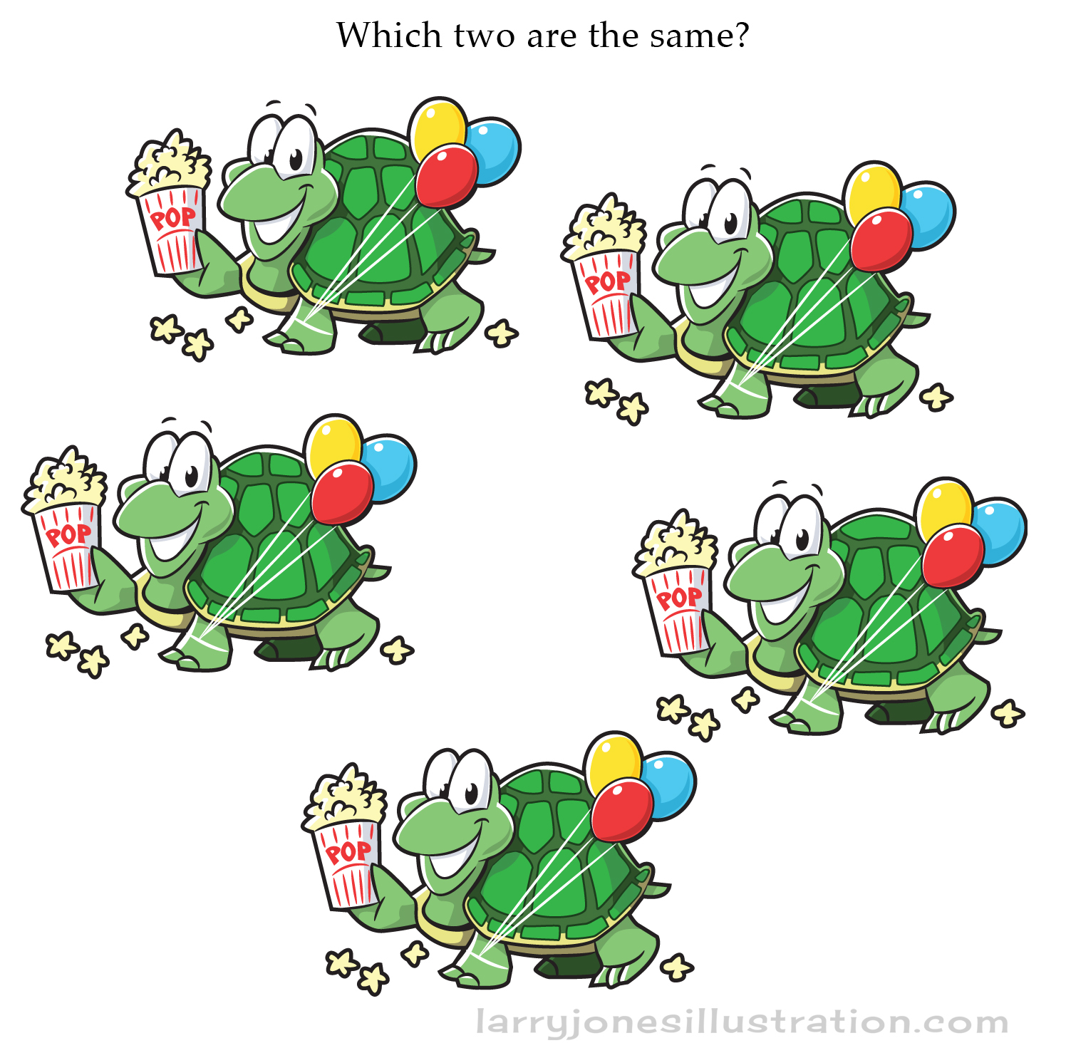
Which Two Are the Same?...
Also... for the same Highlights Puzzlemania issue, this was an additional game illustrated to go along with the "differences" puzzle. It was made for little kids, but how fast can YOU figure it out?...
Cover and Interior Illustration for Highlights Puzzlemania Book
So... every now and then the little kid in me gets all giddy because I get to work for one of the companies I grew up with. Many a dentist's office visit I spent searching for hidden pictures in a Highlights magazine. Here's a recent cover I got to create for an issue of a Highlights Puzzlemania book. The illustration also appears on the inside with a nearly identical version next to it with 20 differences to find. Check out the pics below in case you're stuck in a dentist's office with nothing to do.
Find twenty differences on the next picture...
Find 20 differences from the previous pic!
Here's the original sketch with cropped areas indicated for cover and interior activity pages.
"Scurry Up and Read" Illustrations
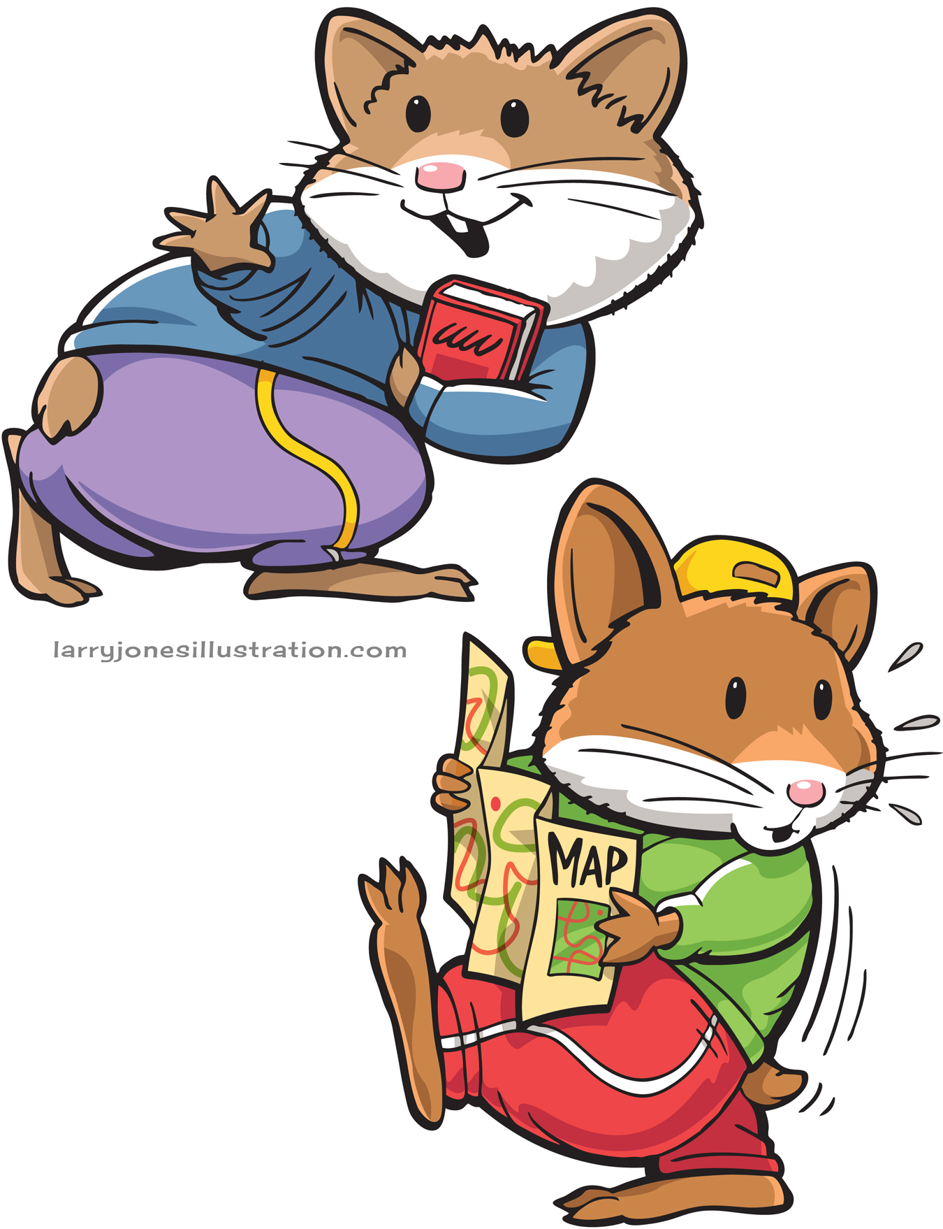
Well, I’ve always said it- Nothing encourages little kids to read more… than hamsters in sweatpants! I used to own a hamster or two and one thing I knew for sure is that you never store books you care about in an active hamster cage… nor do you try to dress them in work-out clothes. But hey- we’re living in the 21st century now and hamsters can do whatever the heck they want to. Anyway, these friendly little fur-balls were illustrated for an educational company who has kept me very busy for over 15 years now. Thanks to them, I find myself drawing lots of books and lots of animals in weird clothes.
Mock Comic Book Cover Characters
"Holy boring content Batman!! This info needs some Ka-ZING!!!" A company that specializes in increasing customer's ease and happiness when dealing with computer-generated voice prompts wanted to make their services more accessible so they came up with the idea of creating super heroes and villains to represent the different aspects of their product. Normally, the program of choice for nice vintage textures and tones would have been Photoshop but my client requested that all art be done in vector. The problem with vector is that it can come out cold, stiff, and plastic unless you're REALLY good at it. So, like any good super-hero-artist-want-to-be, I flew off to the internet to do some quick online tutorials, grabbed TONS of classic comic book reference, and began cranking these babies out:
Board-game Design- The Great Coin Caper
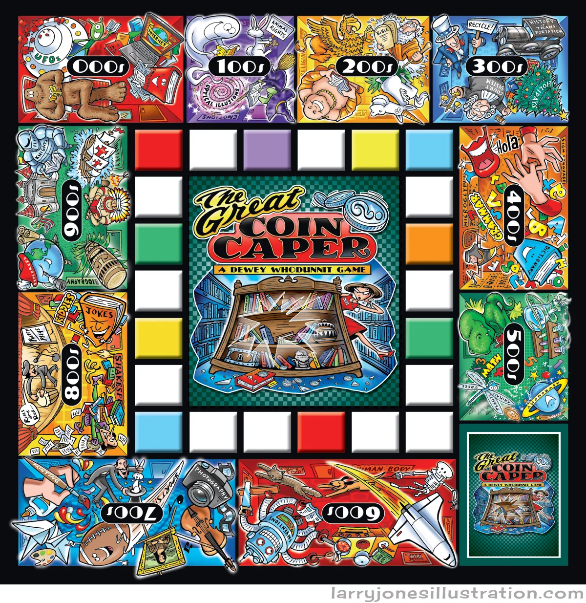
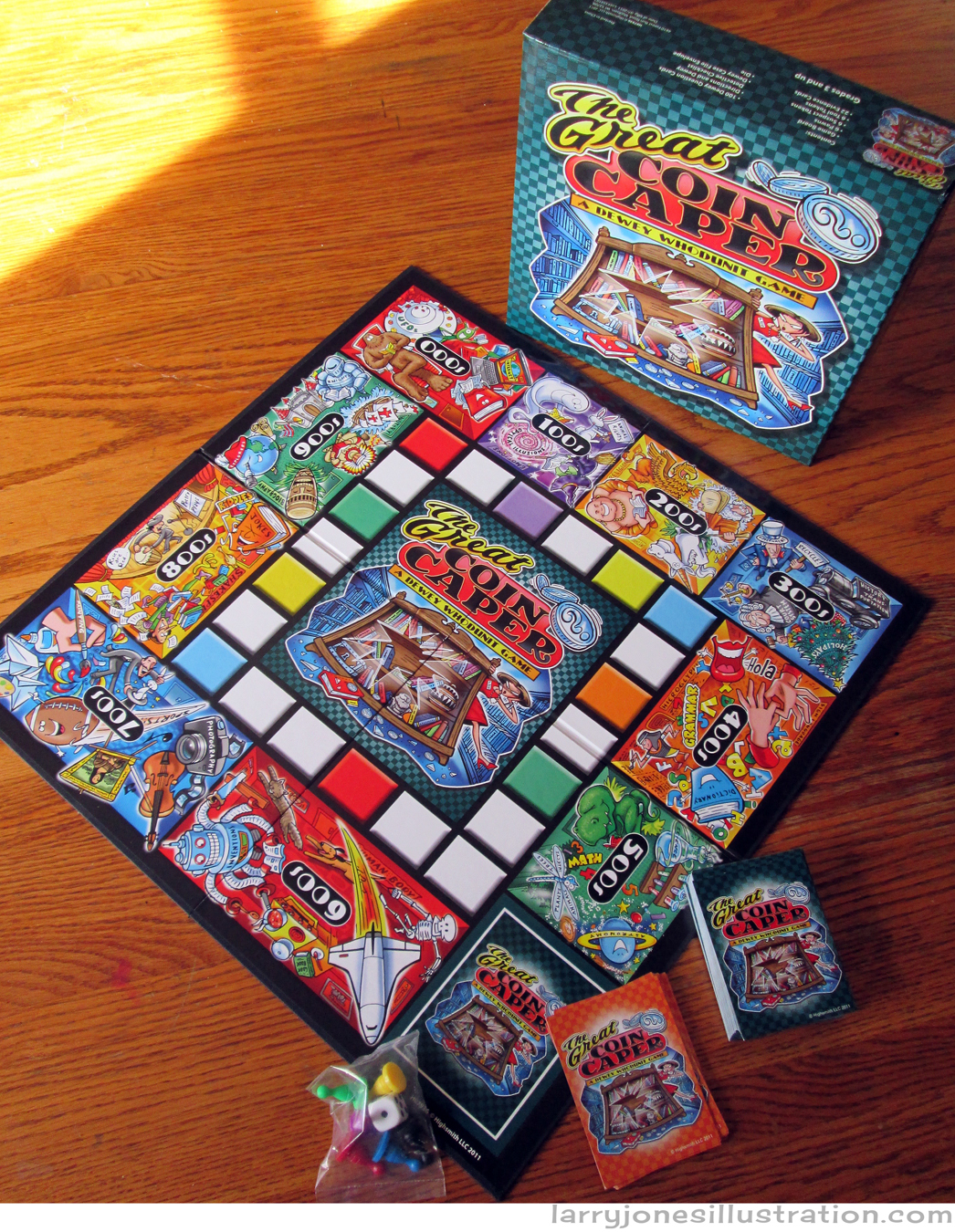
Slowly but surely, the plan is to add more and more history about some of the more interesting projects that have made their way through this studio over the past couple years- in what the Jones Studio scientists refer to as the "Pre-Larryial Blog Era". Many a fun and joyous game board has been designed and illustrated here over the years and today we'll take a look at that momentous educational phenomena known as The Great Coin Caper- A Dewey Whodunit Game- (Highsmith). Attached are some of the original sketches that still remain as well as the finished art. And now ladies and gentlemen, I present to you... some stuff I drew...
"Game Box in Repose on Oak Dining Room Table"
This is how I draw stuff.
The finished game board a la photoshop.
Goofy robots make me happy.
The card face.
Sketches of some of my favorite old acquaintances from school.
This game is fashioned after the game of "CLUE"... and these are your Professor Plums, etc...
...but no-one get's killed by these...
...And the finished game, in morning sunlight, upon shooing the cat away 14 times.
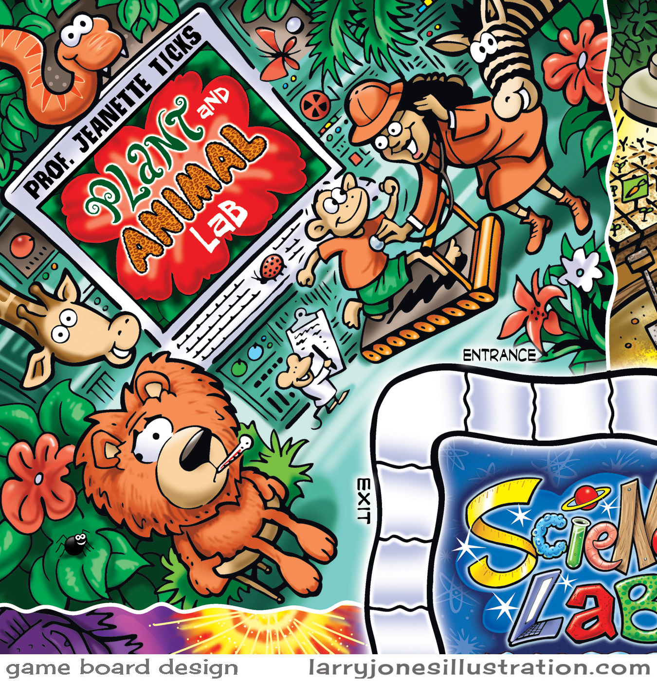
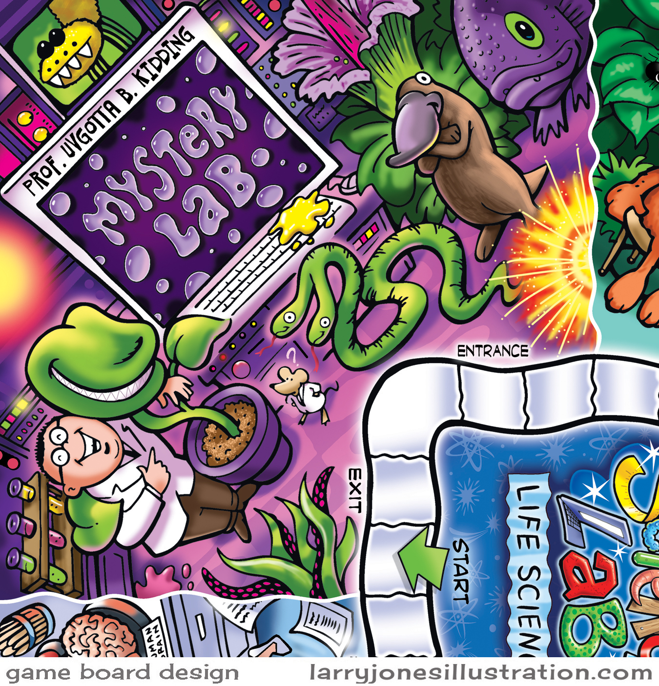
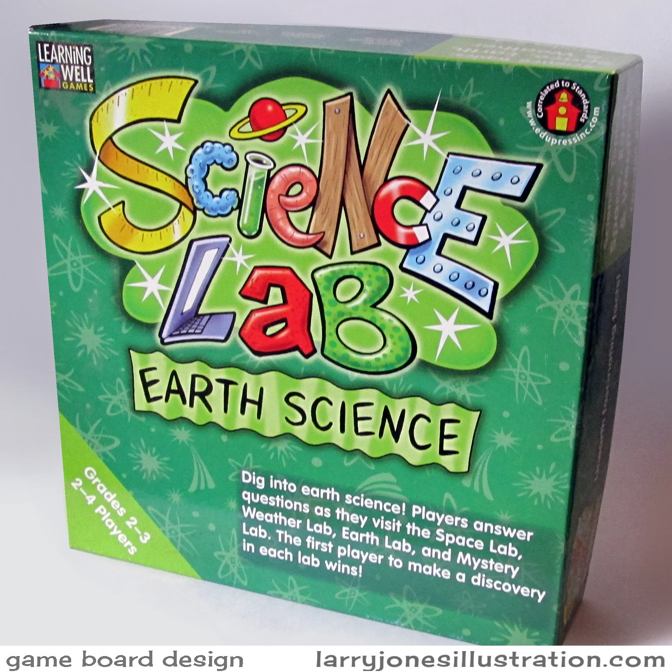
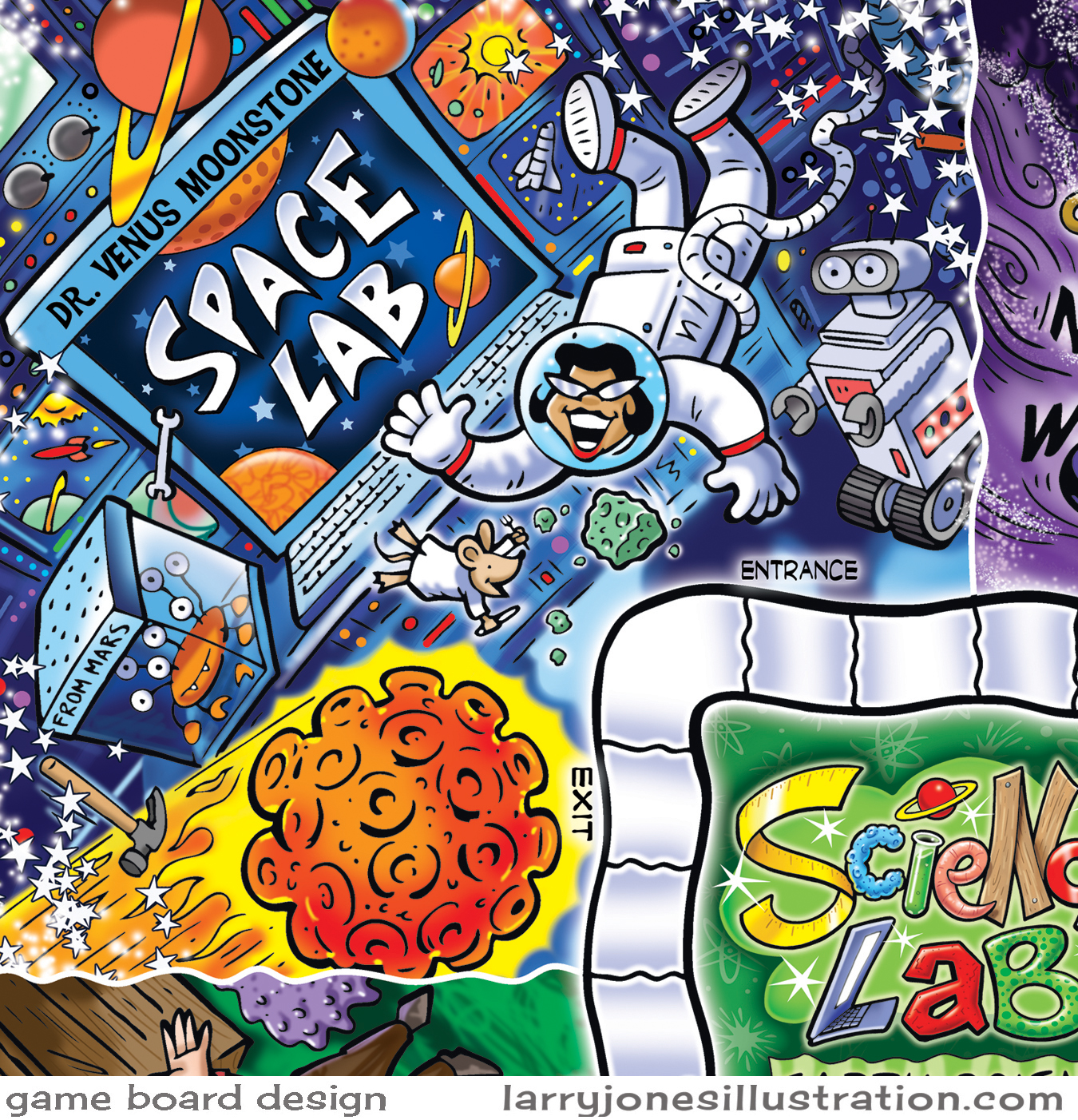
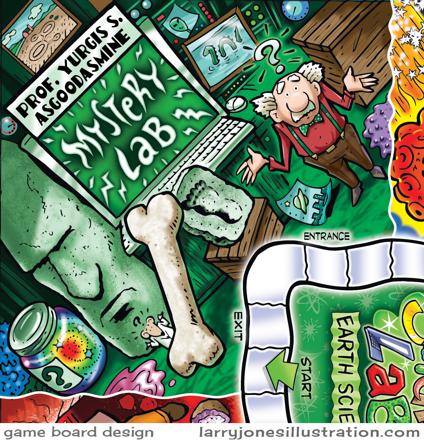
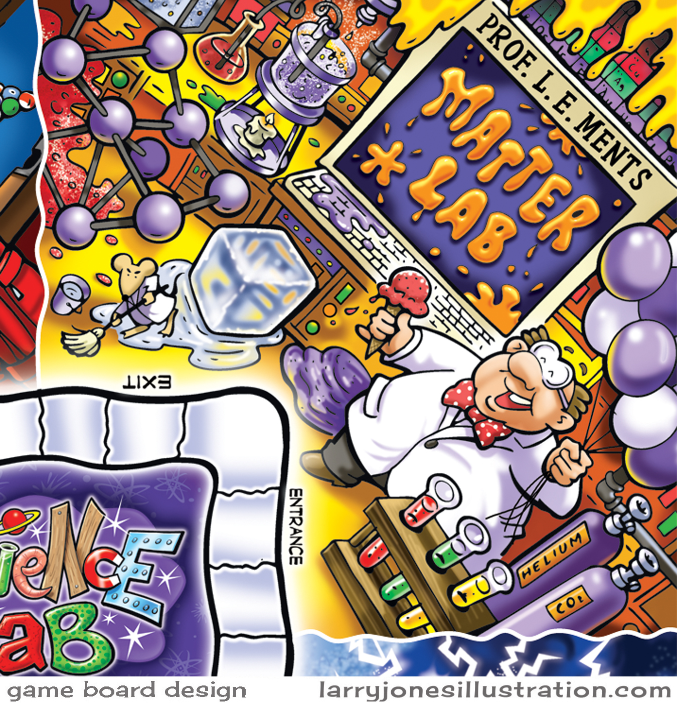
Boardgame Design- Science Lab Series
Boardgame design has always gone down as one of my all-time favorites for illustration projects. In fact, just about any toy or game related assignment is pretty much guaranteed to rev up that kid in me. I love the process of designing and illustrating the different components that go into a working game and then to one day get to finally see the final product sitting on my doorstep. Here's a collection of art for three separate science-themed games I worked on a while back for the educational market. Everything began with very rough pencil sketches and color mock-ups. The final art was hand-inked, scanned in, and colored in photoshop.


