I know, I know... An illustrator should not have too many styles. It confuses people. Although this advice has always made sense, it has also always alluded me. Eating the same food or watching the same movies over and over has never been my thing... nor sticking with one form of art. It's a bit of a sickness really. I try... really try to keep my portfolio down to just a couple of looks, but before I know it, I'm veering off into something totally new and different. I love learning new things- especially illustration styles that are challenging. This year, of all things, it's been digital paintings of sweet happy scenes for cards and puzzles, prompted at the request of a rep I work with. I have to admit, I feel a little weird doing them sometimes- the subject matter is really sappy! But for some reason I find them incredibly relaxing. Maybe because, in the light of sad news out there, it's just nice to imagine a world where dogs, cats and horses can share their pumpkins...
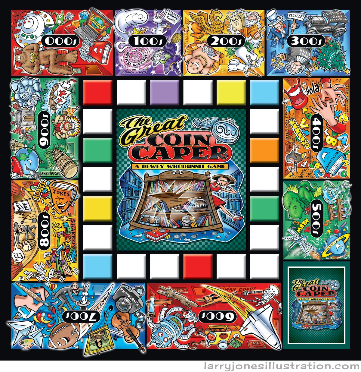
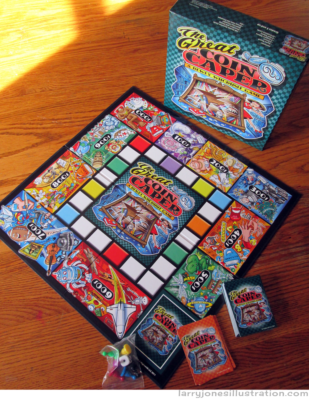
Board-game Design- The Great Coin Caper
Slowly but surely, the plan is to add more and more history about some of the more interesting projects that have made their way through this studio over the past couple years- in what the Jones Studio scientists refer to as the "Pre-Larryial Blog Era". Many a fun and joyous game board has been designed and illustrated here over the years and today we'll take a look at that momentous educational phenomena known as The Great Coin Caper- A Dewey Whodunit Game- (Highsmith). Attached are some of the original sketches that still remain as well as the finished art. And now ladies and gentlemen, I present to you... some stuff I drew...
"Game Box in Repose on Oak Dining Room Table"
This is how I draw stuff.
The finished game board a la photoshop.
Goofy robots make me happy.
The card face.
Sketches of some of my favorite old acquaintances from school.
This game is fashioned after the game of "CLUE"... and these are your Professor Plums, etc...
...but no-one get's killed by these...
...And the finished game, in morning sunlight, upon shooing the cat away 14 times.
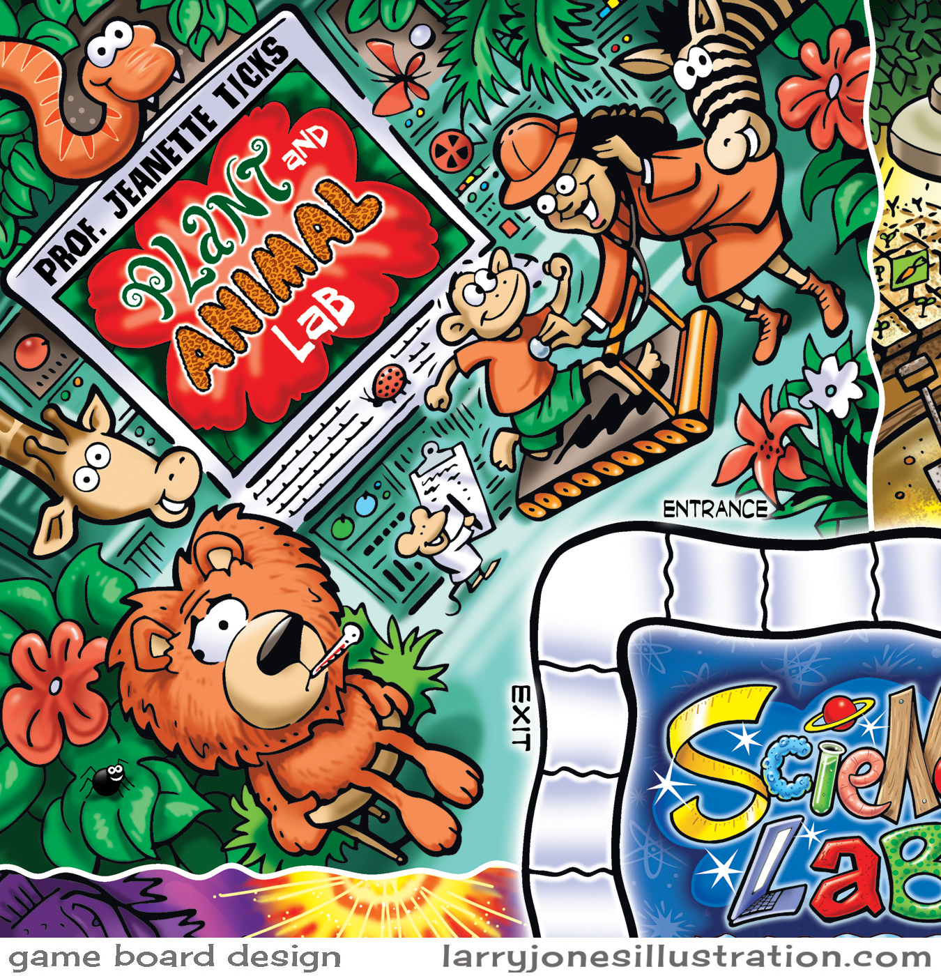
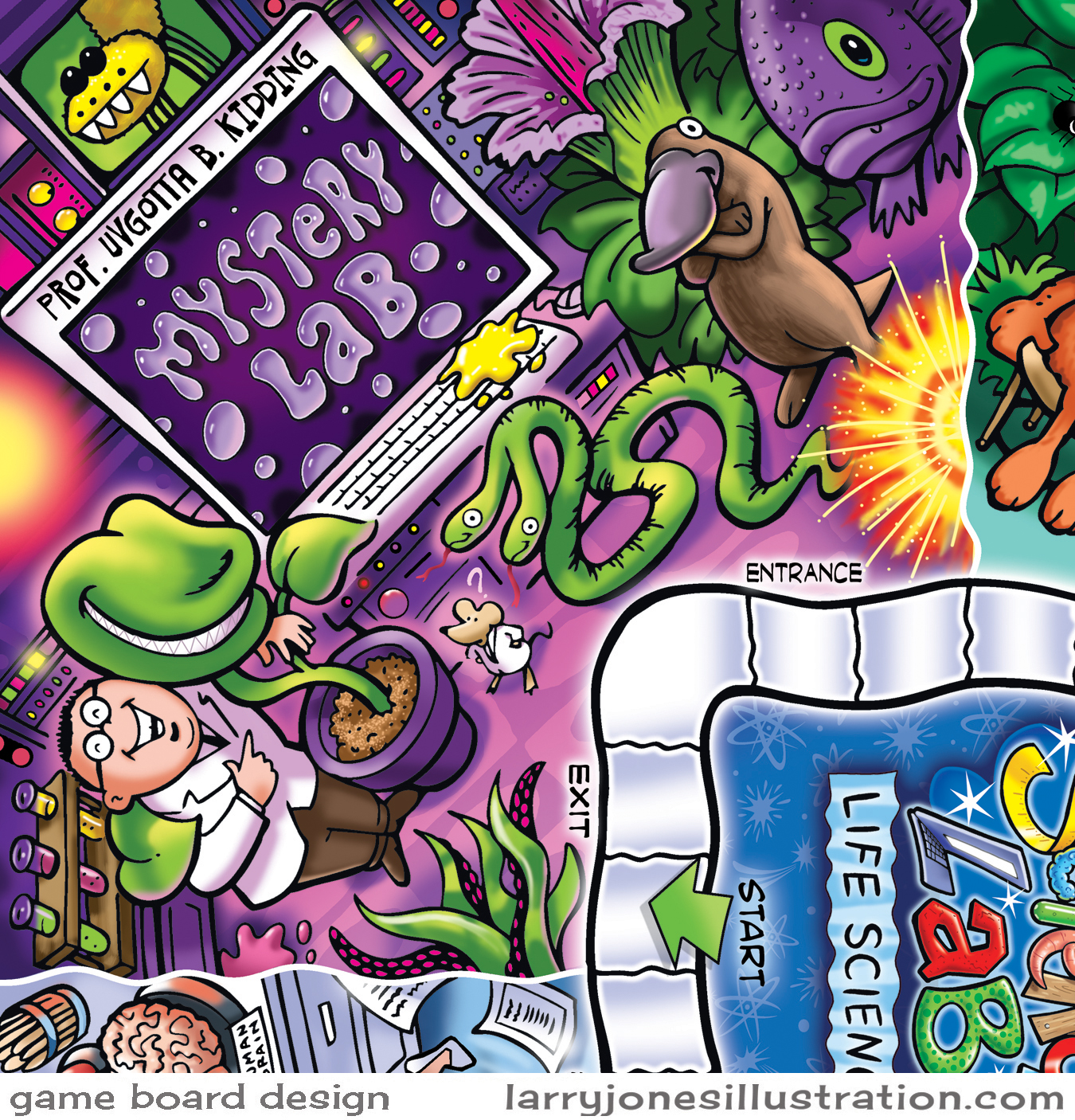
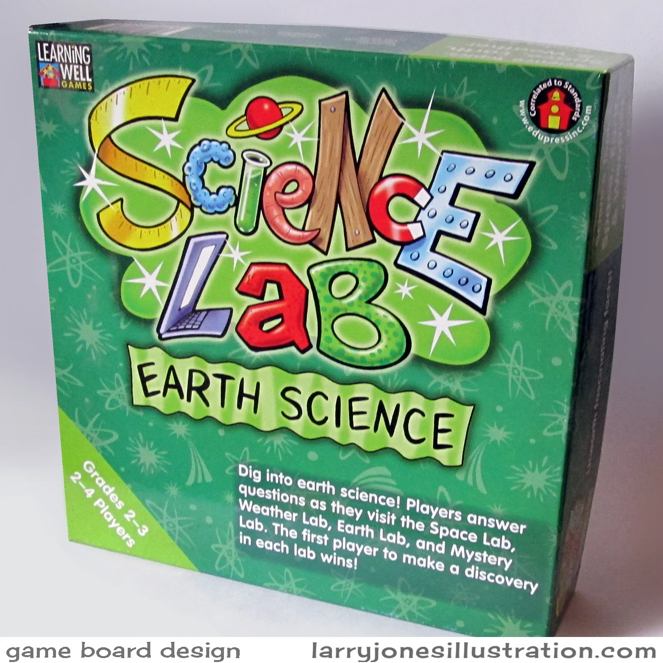
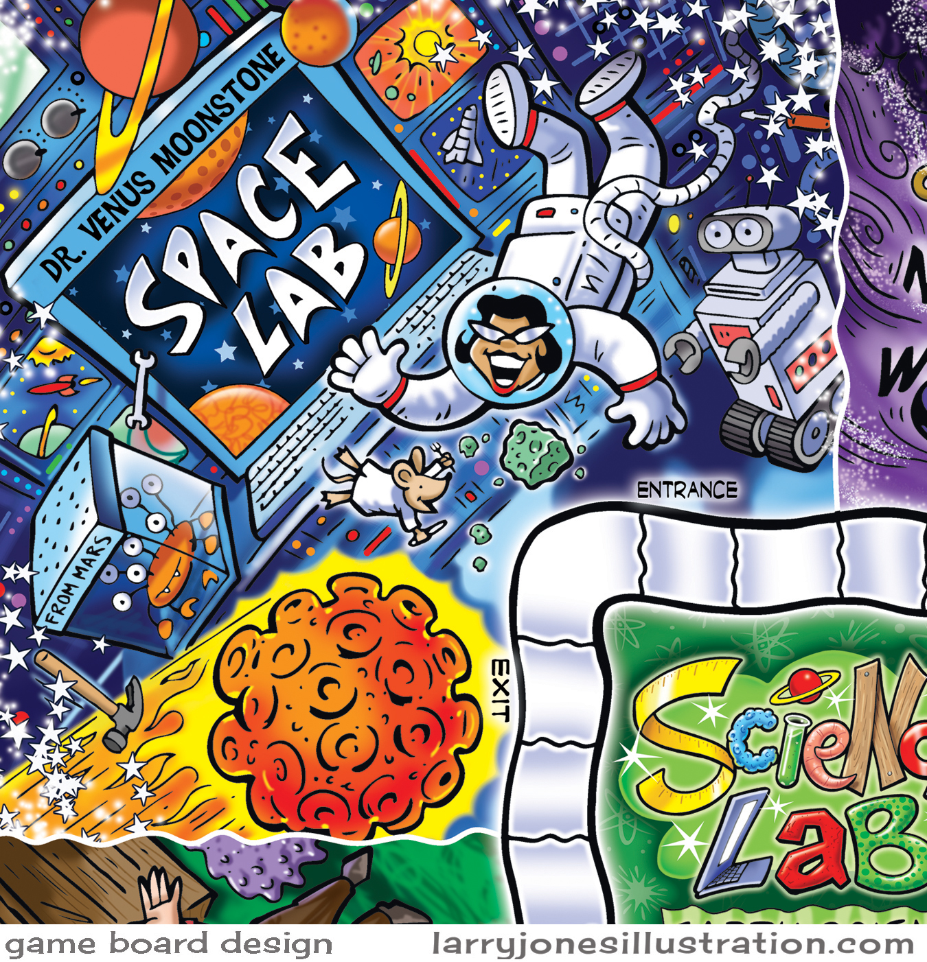
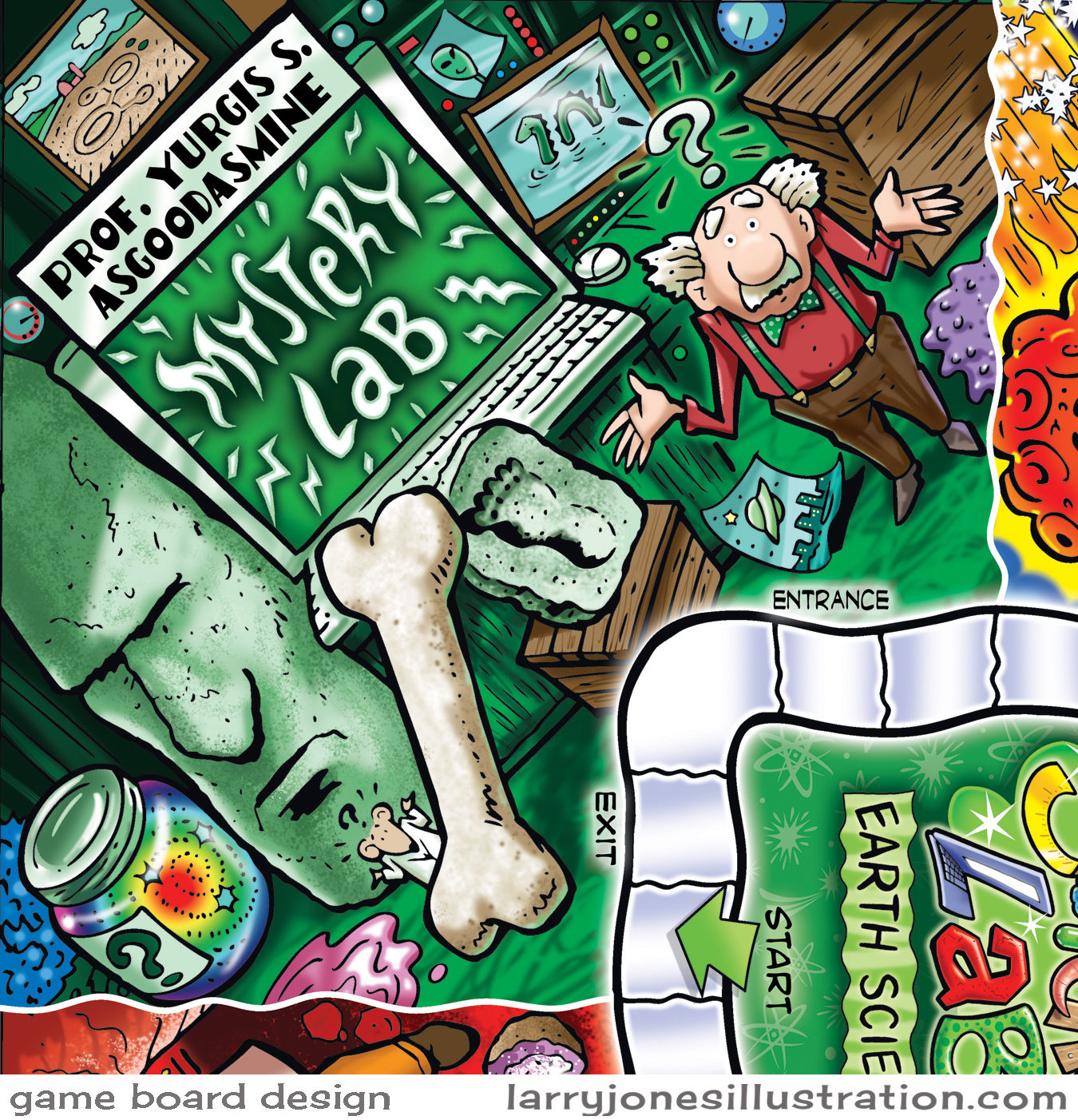
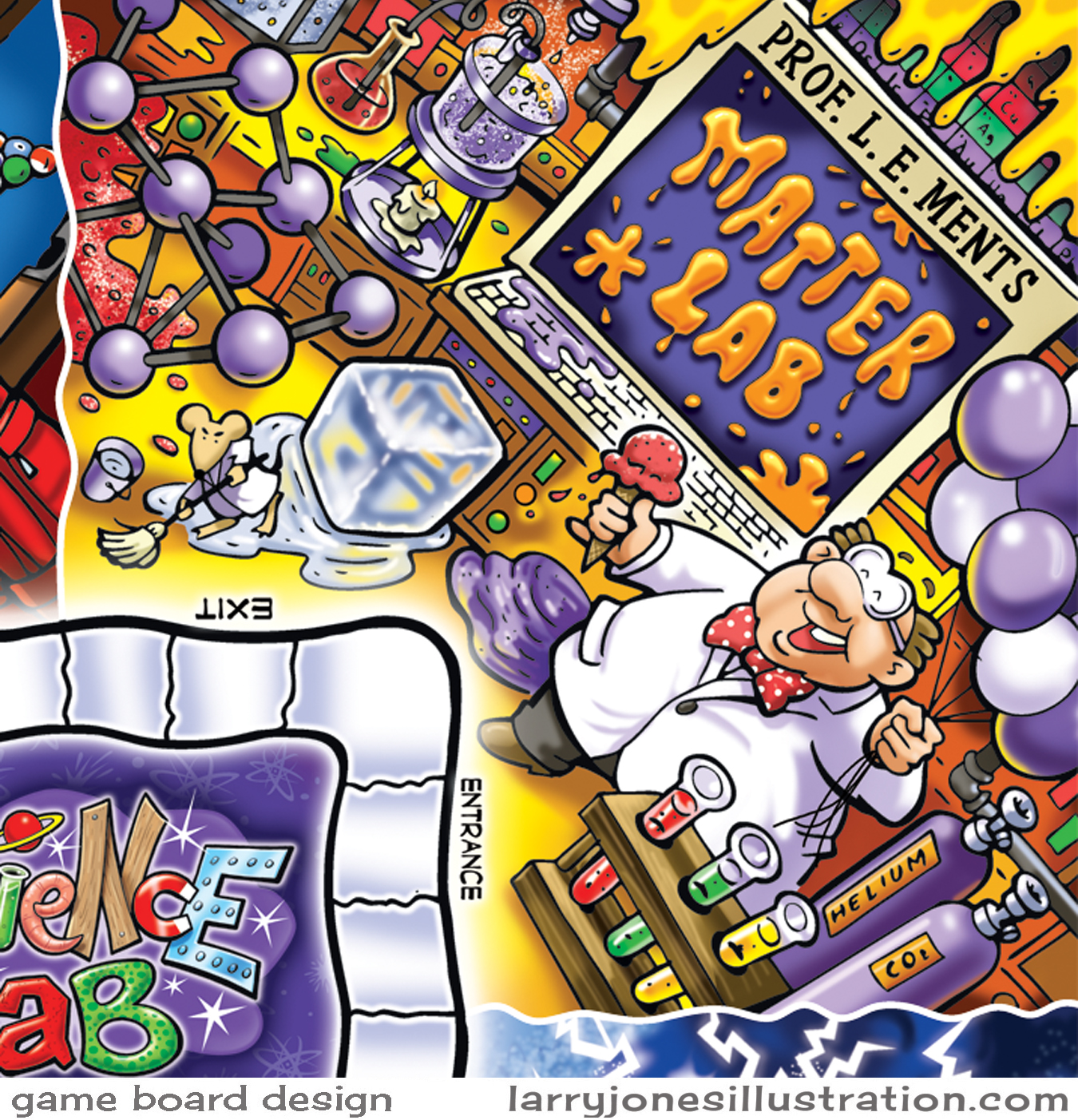
Boardgame Design- Science Lab Series
Boardgame design has always gone down as one of my all-time favorites for illustration projects. In fact, just about any toy or game related assignment is pretty much guaranteed to rev up that kid in me. I love the process of designing and illustrating the different components that go into a working game and then to one day get to finally see the final product sitting on my doorstep. Here's a collection of art for three separate science-themed games I worked on a while back for the educational market. Everything began with very rough pencil sketches and color mock-ups. The final art was hand-inked, scanned in, and colored in photoshop.
The Angst of Artistic Advertising
Although the idea of sending blanket emails out makes me feel a little oogy... it's all part of how the whole artist/advertising thing works these days. I try to keep them short, sweet, and as far from obnoxious as I possibly can with a very easy "unsubscribe" at the bottom. It always amazes me that 20% of emails opened is a GOOD thing! Out of the 2000 I sent today about 400 made it to someone's eyes, however briefly. Other forms of digital advertising are in the works too. Thanks to some very helpful illustrators out there who post excellent videos on the business of art, (Thank you Will Terry and Jake Parker) I'm finally getting off my duff and trying to get a handle on the use of social media. It's a bit of an uphill climb right now, but I'm learning a lot. Here's my image from today's mailing:
Christmas in July
Creating Christmas card art in July is not all that unusual around here. In fact, stop by some time during the summer and you might just hear some classic Bing Crosby completing the mood in the studio. Happily, this time, the art had me dreaming of snorkeling some far-off tropical waters. And yes- there's actually a market for beach-themed Christmas art.
Some Seriously Happy Birthday Candles
Some birthday candles just know how to have a really good time! Rendered in Adobe Illustrator, this festive little vector illustration is currently being sold for garden flags by Toland Home Garden. ( http://www.amazon.com/Toland-Home-Garden-109810-Birthday/dp/B00PVJL126 ). Party on, little candles!
March Fourth! poster illustration
Every now and then I'm fortunate enough to get an illustration job that lets me draw from my heart. (I have a strange heart that looks a lot like a circus run by space aliens.) The Downtown Louisville Street Faire (in Colorado) is hosting a band called March Fourth! They are a combination of about 20 musicians, artisans and dancers who put on an amazing show which includes stilt-walkers, hoopers, wild costumes and vaudeville style dancers. Such a smorgasbord of possible images to play off of! Here's the final poster:
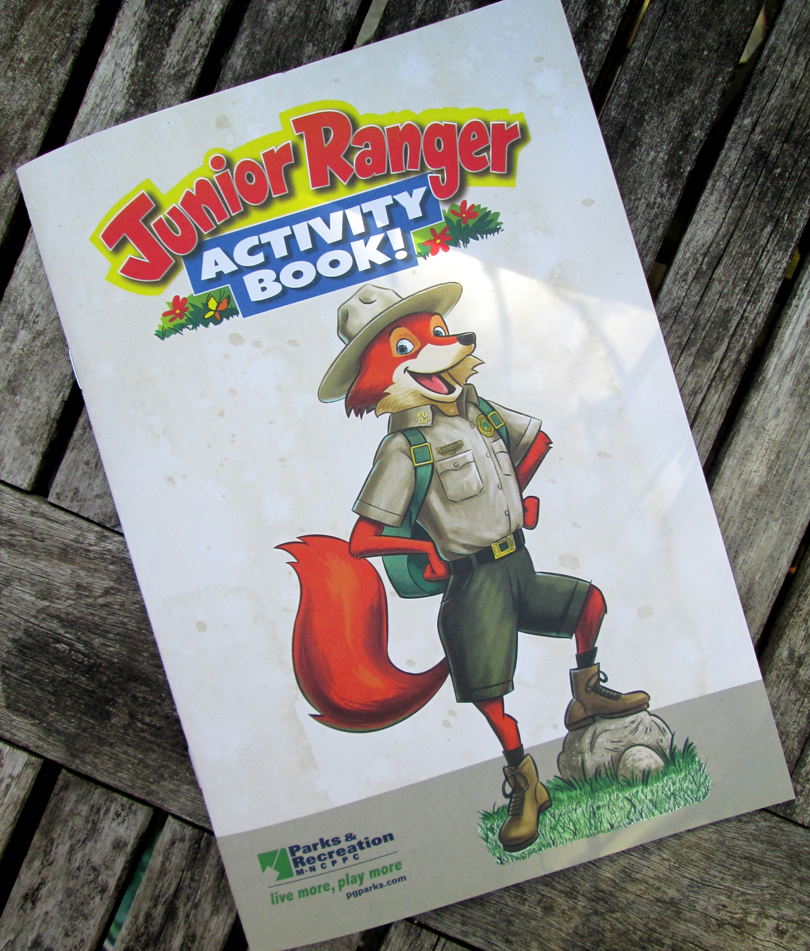
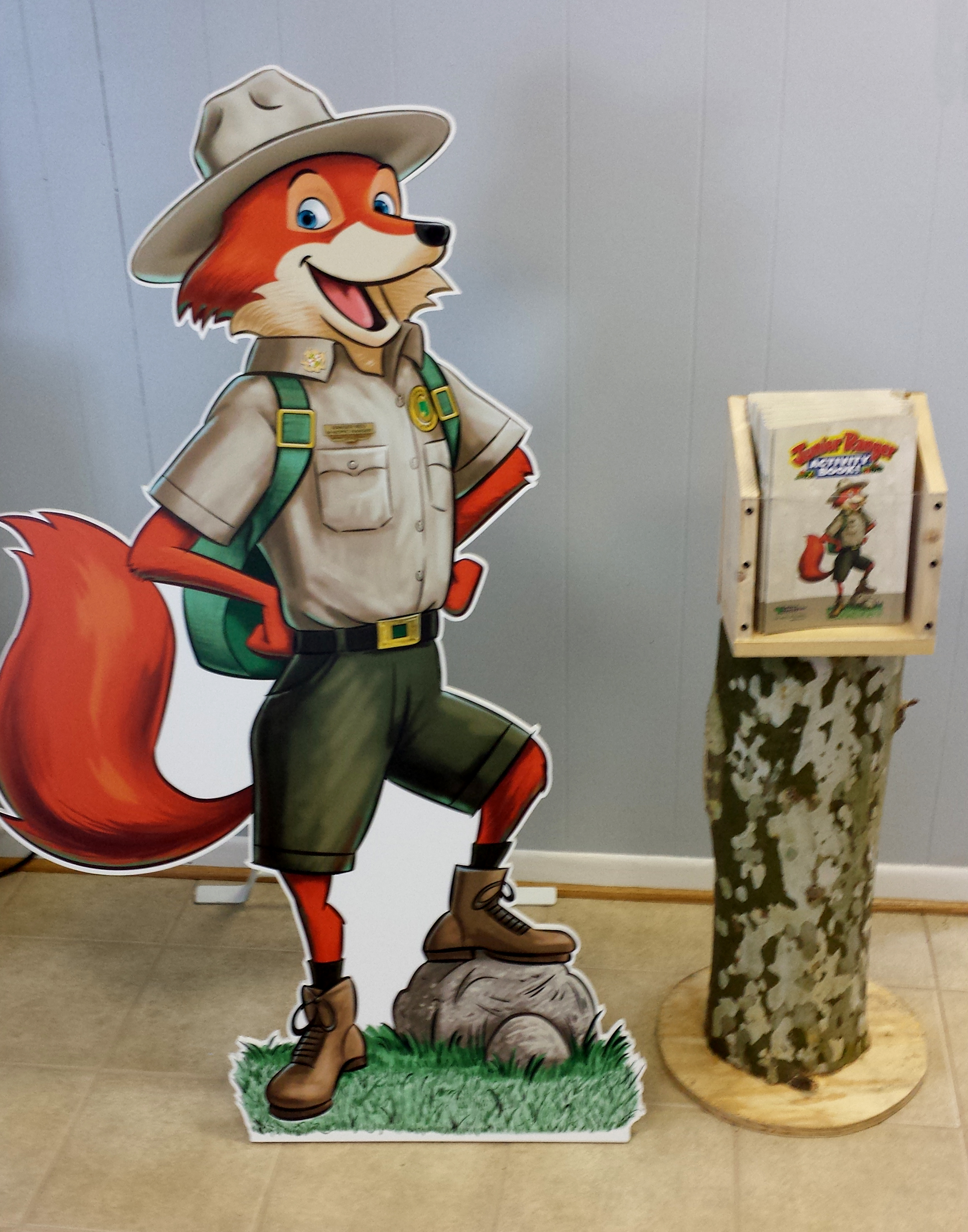
Junior Ranger Activity Book
Over the past few months a slew of illustrations have been pumped out for the Junior Ranger Activity Book! This is a book of games, mazes, puzzles etc that The Maryland-National Capital Park and Planning Commission is handing out as a freebie for young visitors to their parks. As a child I used to love combing through Hi-lights magazine to do the picture searches, etc. Kind of funny that I'm drawing them now.
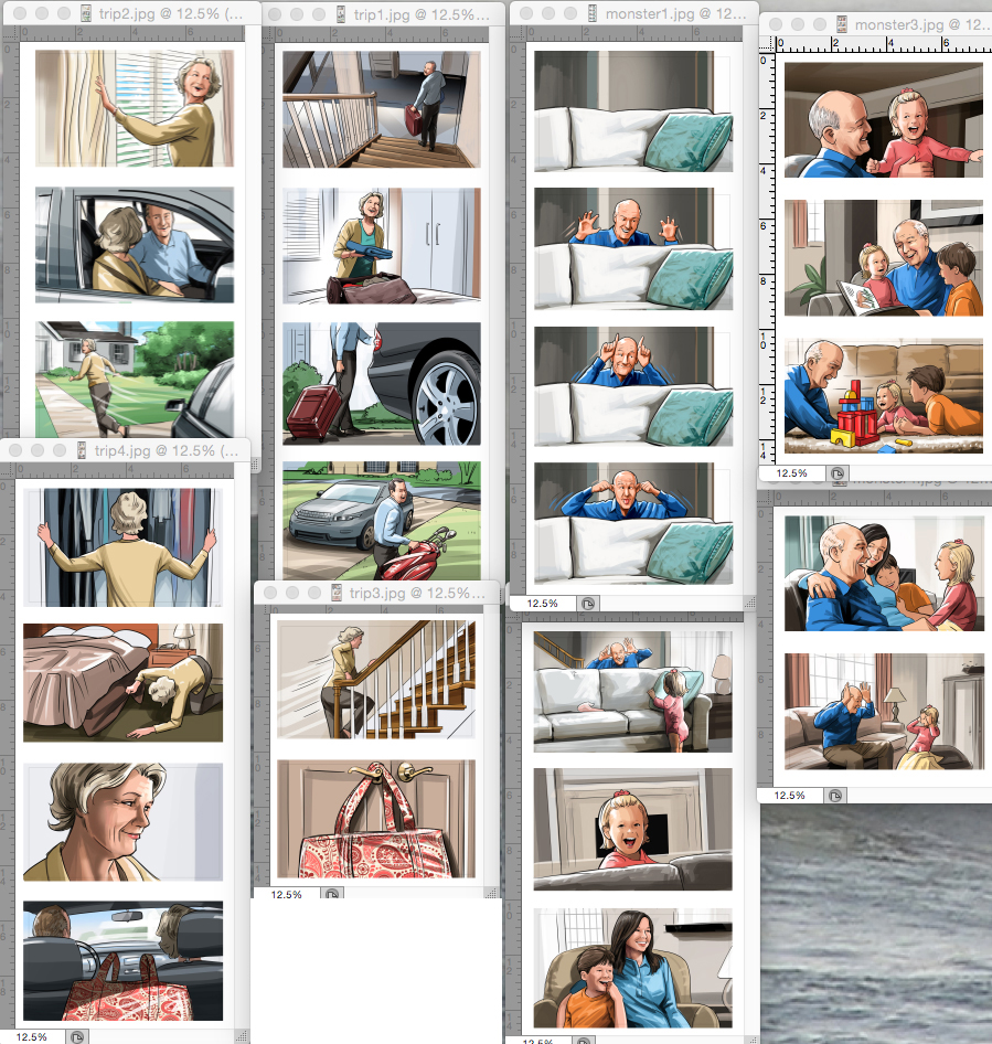
Storyboard Frames for Network Health/ GKV.
Storyboards are where I got my start 25 years ago. I was fresh out of college, with limited talent, but very fortunate to stumble onto an illustrator named Mark Heath who ran a studio that produced "comp art" for local ad agencies. (Comps are basically quick color sketches for creative presentations.) I showed up at his door with a less-than-stellar portfolio and he asked "Can you draw with markers?". I never had before. "Go buy some markers, do some drawings and come back with them tomorrow." Those drawings landed my first illustration job as a full-time comp illustrator. That kind of opportunity is rare. Since then, a lot of thankful prayers have been said about that first offer to get paid for what I love to do. Without that break, I'd probably still be flipping burgers somewhere. Here are some panels from a very recent comp job I worked on, minus the marker fumes...
Spot Illustrations for a Children's Publication
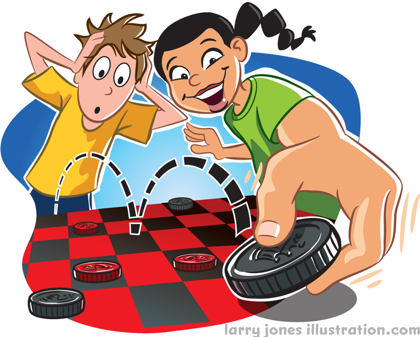
Here are eight recent spot illustrations done for a children's magazine that won't be published for a few months... (so I can't say which one right now.) The theme of the article is about the origins of common games we all know and play.
Adobe illustrator is becoming more and more my program of choice these days. I don't know if it's because it produces such clean art, or the fact that it has unlimited "undos". All I know is that it takes the sloppy artist in me and cleans him right up... like having my own personal illustration robot to do my bidding.
The game of chess originated in India where the bishop was actually a camel or elephant.
Kite flying got it's start in China.
Checkers has 3000 year old roots in Iraq.
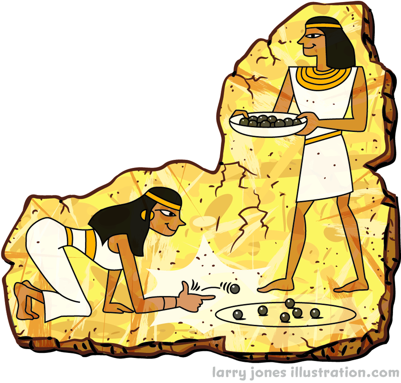
The game of marbles originated in Egypt.
The game of Jacks used to be called "knucklebones" and originated in Greece... and used real bones!
We have the Dutch to thank for our jump-ropes.
An ancient Greek vase was found with art depicting someone playing with a yo-yo.
A 3500 year old clay top was found in Iraq.
"Exercise Your Mind- Read!" poster and spots
Thanks to my friends at Demco over the years, my portfolio now has a pretty extensive collection of reading-themed art. This particular series was created for their 2015 library theme... and this time more geared to adults as opposed to my usual kid stuff. With the "exercise" theme established, and a request to have the art look a bit old-school and retro in nature, most of my creative decisions were already made. The aged effects are thanks to photoshop. All line work created in Adobe illustrator on a Wacom Cintiq monitor.
My Dainty Manly Hands
Along the theme of jewelry here... A while back I received a simple line art illustration assignment from an art director at GKV. A magazine ad for Pandora jewelry was to have "peel-off" bracelet stickers to try on with a little "how-to" illustration explaining the mechanics of the complex sticker operation. So, as an illustrator, I needed some beautiful hands to draw from. No-one was around to shoot, so I did what any committed artist would do, and posed my own hands as daintily as I possible could. Here's a pic of the process:
Comic book style magazine ad illustration
"Holy diamond ring Batman!" Recently a client asked if I could create an ad for Eric Olson Jewelers in a mock-comic book style. After receiving the client's layout, I clicked about for a short while to find a good face for reference and took that mock-up straight to a finished pencil sketch. The black line was digitally inked in Adobe Illustrator and then imported into Photoshop where color and a series of effects were applied. To get that retro printed feel, I scanned-in a textured paper background, and added some layers of speckles and noise. Also thanks to Mr. Retro's Permanent Press filter, I created a layer of ben day dots to finish the comic book effect.
Here we go a blogging...
So... New site on Squarespace... and new blog site as well. Trying to figure out how to work this thing. Please stay tuned...


